The Making of a Book Cover
They say “You can’t judge a book by its cover”, but you and I know that we DO judge books by their cover when looking for something new to read. Whether you’re browsing the shelves of a bookshop, or scrolling through your favourite categories on Amazon, it’s almost certain you won’t flip the book over (in a bookshop) or flip your eyes right (on Amazon) to read the blurb unless something about the title or cover design intrigues or appeals to you.
In the run-in to self-publishing my novel Teak Lord, I read lots about the importance of covers and started looking at the covers of hundreds of new releases. Most of them had the title in huge capitals and abstract blotches of colour in the background. Very arty, maybe, but this approach does nothing for me. “I know” I thought,” I’ll make my cover as different as I can from those I’m looking at now.”
In the run-in to self-publishing my novel Teak Lord, I read lots about the importance of covers and started looking at the covers of hundreds of new releases. Most of them had the title in huge capitals and abstract blotches of colour in the background. Very arty, maybe, but this approach does nothing for me. “I know” I thought,” I’ll make my cover as different as I can from those I’m looking at now.”
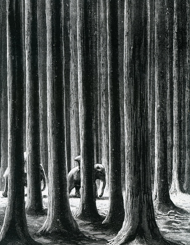
I liked the ink sketches by Eugene Bernand in a book titled Travels in Upper Laos and Siam by French explorer Doctor Neis, which coincided with the time frame of my novel, and one minimalist image by Bernand in particular appealed to me. It was of towering teak trees with huge girths, giant versions of teak elsewhere, with a glimpse of elephants walking in the distance. Neis described the scene thus: “One traveled in these forests as between the pillars of a gigantic temple.” I had appropriated Neis’ wonder at the scene (though not his words!) for a similar description in Teak Lord.
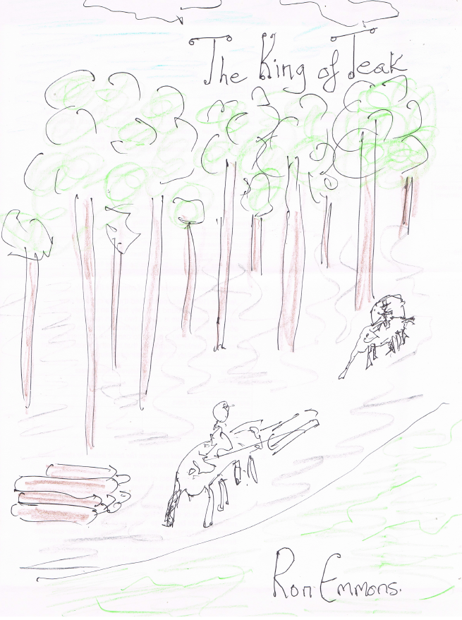
Chairat, head of the team at Within Design, who I had contracted to design a cover, also liked the Bernand image, so that was our starting point. I’m hopeless at drawing, but I scrawled a childish picture of a teak forest beside a river, with elephants (I know, I’m not too good at elephants) pulling logs to give an idea of what content I wanted on the cover. At that stage the working title was The King of Teak.
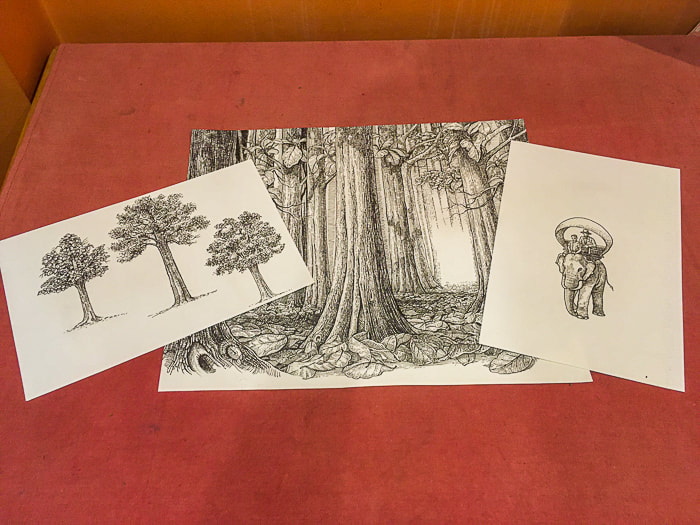
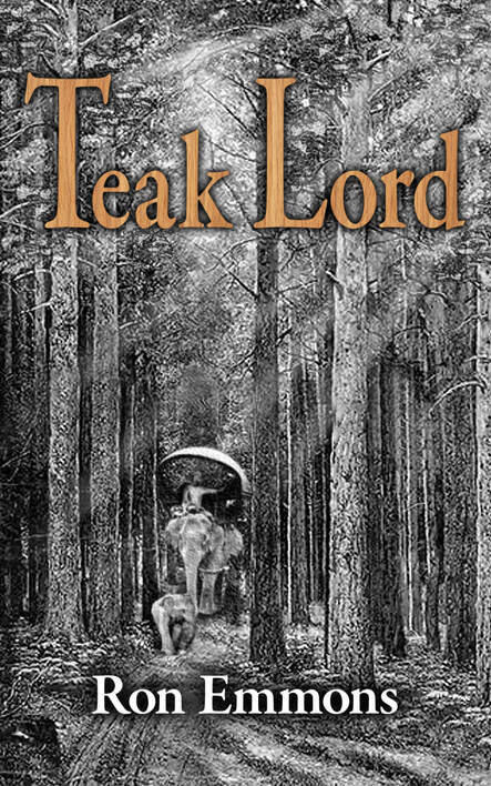
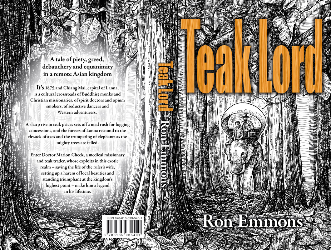
Chairat thought this image was too ‘busy’, so his illustrator began with a clip-art image showing only forest, elephants and a mahout (elephant handler). I asked for the title to be written in tall letters to echo the tall, straight trees, and I liked the fact that it stood out boldly and was picked out with a vertical wood grain effect. The clip-art trees looked more like pines so I asked Chairat to make sure some big teak leaves were prominent in the image.
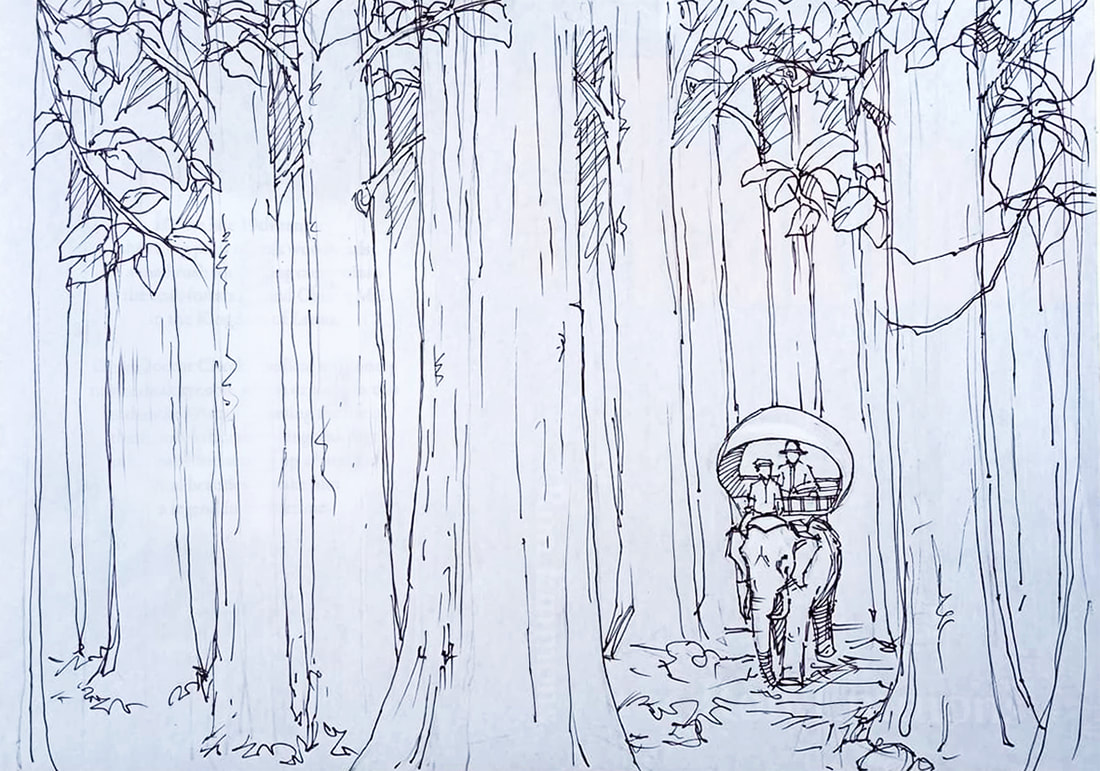
Next came the illustrator’s initial sketch of the front and back covers, with plenty of forest on the left where we could superimpose the blurb for the book. I particularly liked that a huge tree ran the length of the spine and conveniently divided the image.
I remembered my description in Teak Lord of Doctor Cheek passing through the Mae Lao forest near the end of Section 34 – Railway Dreams: “An utter silence surrounded them as the elephants padded over a carpet of huge teak leaves and between the massive boles”. I asked the illustrator to make a carpet of leaves, which he duly provided.
I remembered my description in Teak Lord of Doctor Cheek passing through the Mae Lao forest near the end of Section 34 – Railway Dreams: “An utter silence surrounded them as the elephants padded over a carpet of huge teak leaves and between the massive boles”. I asked the illustrator to make a carpet of leaves, which he duly provided.
I had not set out with the intention of finding a cover image that seemed to exactly reflect the words in the book, but neither had I known how the Teak Lord tale would end as I was writing it. Sometimes it’s best when these things just happen of their own accord. In any case I’m pleased with the Teak Lord cover, and hope it draws curious readers into a web of mystery inside.
